
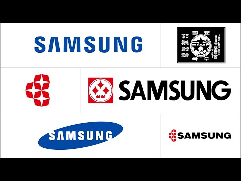
In the hyper-competitive world of consumer electronics, a logo is far more than a graphic—it’s the visual shorthand for a brand’s entire identity, heritage, and ambition. Few companies illustrate this evolution more dramatically than Samsung. The journey of the Samsung logo mirrors the brand’s meteoric rise from a regional trade exporter to a global innovator, with its advertising campaigns serving as the primary stage for each transformation. This article traces the symbiotic relationship between Samsung’s logo evolution and its landmark ad campaigns, revealing how each redesign was a strategic declaration of a new era.The Foundational Era: The Birth of a Star (1938–1969)Samsung was founded in 1938 by Lee Byung-chul as a trading company exporting dried fish, vegetables, and noodles. The earliest logos were simple wordmarks in Korean hanja, representing "three stars" (三星), a symbol of something large, numerous, and powerful.
Campaign Context: Early "advertising" was purely commercial communication—trade documents, storefront signs, and product packaging. The logo was a mark of business reliability, not consumer aspiration.
Visual Reference: While no TV ads exist from this period, historical archives show the logo on early documents and products. [A historical compilation can be seen here:
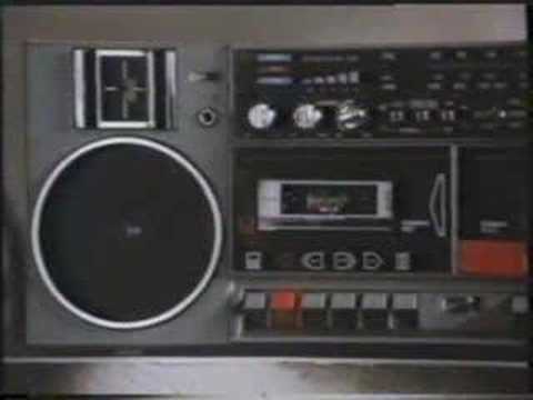
Campaign Context: Early electronics ads focused on durability and in-home practicality for black-and-white TVs and refrigerators. The logo’s solid frame communicated trustworthiness to first-time appliance buyers.
Visual Reference: Rare footage of early Korean advertising showcases this logo on products. [See early Korean TV ads featuring appliances:

Campaign Context: This logo debuted as Samsung pushed into international markets. 1980s ads focused on quantity and variety, showcasing everything from microwaves to VCRs. The logo’s celestial theme communicated limitless potential.
Visual Reference: International ads from the 1980s feature this logo prominently. [Example: A 1985 Samsung VCR ad:
The Design: The open ellipse symbolized limitless innovation and openness to the world. "Samsung Blue" conveyed trust and technology.
Campaign Context - The "DigitAll" Era (1990s-2000s): As Samsung challenged Sony, campaigns focused on sleek, desirable digital products. The blue ellipse was the seal of this new "digital all" philosophy.
Visual Reference: The iconic "Digitall Welcome" campaign. [
 Watch YouTube video
Campaign Context - The Galaxy Rise (2010s): Advertising became lifestyle-oriented and directly competitive. The logo provided corporate trust, while focus shifted to the "Galaxy" sub-brand.
Visual Reference: The launch campaign for the Samsung Galaxy S III, highlighting smart features. [
Watch YouTube video
The Minimalist Refinement: A Flatter, Digital-First World (2022–Present)
In 2022, Samsung introduced a subtle but significant refresh, flattening the 3D ellipse into a 2D design and refining the wordmark for digital clarity.
Design Rationale: Driven by digital usability across smartwatch screens, apps, and social media.
Campaign Context - The Ecosystem Era: Coincides with the "Together for Tomorrow" vision and campaigns focused on seamless, connected experiences (Galaxy, Bespoke appliances).
Visual Reference: The "Join the Flip Side" campaign for the Galaxy Z Flip 5, showcasing the refined logo in a digital-first ad. [
Watch YouTube videoVisual Reference: The "Bespoke" home ecosystem campaign, featuring the minimalist logo. [
Watch YouTube video
Expert Analysis: The Logo as Strategic Lever
Samsung’s logo evolution demonstrates a masterclass in corporate rebranding through evolutionary refinement.
"The 1993 move to drop the stars was one of the boldest and most successful acts of corporate rebranding," notes a brand strategist. "The open ellipse was a blank canvas for future innovation. Its strength lies in its semiotic flexibility—it can mean technology, connectivity, or trust depending on the campaign narrative."
The logo’s consistency has built immense global brand equity, while its 2022 flattening shows an adaptive focus on the digital ecosystem where the brand now lives.
Conclusion: More Than a Badge, A Beacon
The Samsung logo’s journey through its advertising campaigns tells the story of a company in perpetual motion. Each redesign was a proactive alignment with a new corporate manifesto, launched via global campaigns.
From the functional ads of the 70s to the cinematic ecosystem spots of today, the logo has been the constant—adapting in form but unwavering in its promise of innovation. The flat, digital-native logo now signifies that Samsung designs the connected fabric of digital life itself. The evolution of the Samsung logo in advertising is the visual biography of a brand that consistently uses its campaigns to signal its next great leap forward.
Key YouTube Visual References (Chronological Order):
Logo History Overview:
Early Korean TV Ads (1970s-80s):
1985 VCR Ad (Dynamic Star Era):
"Digitall Welcome" Campaign (1990s):

Galaxy S III Launch (2012):

"Join the Flip Side" Galaxy Z Flip 5 (2023):

Bespoke Ecosystem Campaign (2020s):

Discover the captivating background music featured in the Samsung SmartThings 2026 ad. Uncover the artist and track that enhances this innovative commercial.
Discover how Samsung Ads showcases the groundbreaking innovation of foldable technology, transforming the way we interact with devices and advertising.
Discover the ultimate showdown between Samsung and Apple in 2026. Explore our detailed flagship ad comparison to find out which brand reigns supreme.
Discover how Apple masterfully incorporates music in its advertisements to enhance brand storytelling and create emotional connections with audiences.

Explore the allure of Scarlett Johansson in luxury advertising campaigns, where her iconic style and charisma elevate prestigious brands to new heights.

Discover the most emotional advertising campaigns of the last decade that touched hearts and inspired change. Explore their powerful stories and impact.

Discover the best Nike commercials of the last decade, showcasing innovative storytelling and iconic athletes that inspire and motivate.
Explore the captivating history of Coca-Cola advertising, from iconic campaigns and memorable slogans to its global marketing evolution. Discover the brand's impact!

En 2025, las finanzas personales en México evolucionan más rápido que nunca. Por eso, entender y comparar tus opciones de crédito
Online gaming operators struggle to stand out, stay compliant, and retain players, challenges that traditional platforms often fail to meet

En México, cuando ocurre una emergencia de salud, el coche se descompone o simplemente no alcanza para cubrir un recibo urgente