You've spent time, energy, and budget driving traffic to your website. But if your landing pages aren't optimized to convert, that traffic is walking out the door—taking your investment with it. The gap between click and conversion is where most advertising fails. A great ad promises value; a poor landing page fails to deliver it.
This comprehensive guide will show you exactly how to optimize your landing pages to turn more visitors into customers, leads, or whatever your conversion goal may be. You'll learn the principles, strategies, and technical tactics that separate high-converting pages from those that leak potential, complete withYouTube tutorialsto help you implement each strategy.
Why Landing Page Optimization Matters
The numbers tell a stark story about the importance of landing page performance.
| Average conversion rateacross industries is 2-5% | Most pages are underperforming |
| 68% of businessesdon't have a dedicated landing page for each campaign | Missed opportunity for relevance |
| Landing pages with 10+ form fieldsconvert 12% lower than those with 3-4 | Friction kills conversions |
| Pages with videocan increase conversions by 86% | Visual explanation matters |
| 53% of mobile usersabandon sites that take >3 seconds to load | Speed is critical |
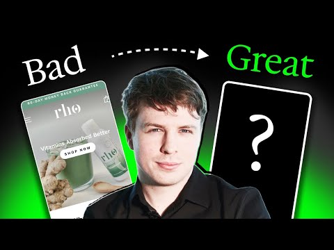
Watch the Tutorial: Why Landing Pages Make or Break Your Campaigns
Learn why landing page optimization is essential for advertising success.
-
Watch here:
 Watch YouTube video
Part 1: The Landing Page Conversion Framework
Every high-converting landing page is built on a simple, proven framework. Understanding these elements helps you diagnose what's working and what's not.
The Core Elements
| Headline | Grab attention, state value | Does it match the ad that brought them here? |
| Subheadline | Expand on the promise | Does it clarify the value proposition? |
| Visual | Show what you're offering | Does it demonstrate the product or result? |
| Benefits | Explain the value | Does it answer "what's in it for me?" |
| Social Proof | Build credibility | Does it show others have succeeded? |
| CTA | Drive action | Is it clear, compelling, and visible? |
| Trust Signals | Reduce risk | Does it address objections and concerns? |
The Message Match Principle
The single most important factor in landing page conversion ismessage match—the consistency between what your ad promised and what your landing page delivers.
| Headline | "Get 50% Off All Shoes" | "50% Off All Shoes—Shop Now" |
| Visual | Shoes on sale | Featured sale shoes |
| Offer | 50% off | 50% off, clearly displayed |
| CTA | "Shop Now" | "Shop the Sale" |
When there's a mismatch—if the ad promises a discount but the landing page hides it, or if the ad uses playful language but the landing page is formal—visitors bounce. Their trust is broken, and they leave.
Watch the Tutorial: The Message Match Principle
Learn why alignment between ad and landing page is critical.
-
Watch here:
Watch YouTube video

Part 2: Craft Headlines That Stop and Convert
Your headline is the first thing visitors see—and often the only thing they read before deciding whether to stay or leave.
The Headline Formula
A strong headline typically includes one or more of these elements:
| Value proposition | "Get More Leads in Half the Time" |
| Specific outcome | "Lose 10 Pounds in 30 Days" |
| Problem/solution | "Tired of Complicated Software? Meet the Simple Alternative" |
| Curiosity | "What 10,000 Marketers Know That You Don't" |
| Urgency | "Sale Ends Tonight—Save 50%" |
Headline Best Practices
| Match the ad that brought them | Be clever at the expense of clarity |
| State the primary benefit | Focus on features |
| Keep it under 10 words | Make visitors work to understand |
| Use specific numbers | Use vague terms ("great," "amazing") |
| Test variations | Assume you know the winner |
The Subheadline Role
Your subheadline supports the headline with additional context, detail, or secondary benefits.
| "Get More Leads in Half the Time" | "Join 10,000+ marketers using our AI-powered platform to double conversions—without doubling your workload." |
| "Lose 10 Pounds in 30 Days" | "Scientifically-proven meal plans designed by nutritionists. No starvation. No gimmicks." |
Watch the Tutorial: Writing Headlines That Convert
Learn how to craft compelling headlines that keep visitors on the page.
-
Watch here:
Watch YouTube video
Part 3: Use Visuals That Support the Message
Visuals aren't decoration—they're communication. The right visual can explain your product, demonstrate value, and build emotional connection faster than text.
Types of Visuals and When to Use Them
| Product photo | Tangible products | E-commerce, physical goods |
| Screenshot | Software, apps | SaaS, tools, platforms |
| Hero shot | Aspirational | Beauty, lifestyle, travel |
| Explainer video | Complex products | Software, services, educational |
| Before/after | Transformational | Fitness, home improvement, beauty |
| People | Emotional connection | Services, community-focused |
| Diagram/illustration | Educational | B2B, technical products |
Visual Best Practices
| Show the product or result in context | Use generic stock photos |
| Demonstrate how it works | Rely on text to explain |
| Use high-quality, professional images | Use pixelated or amateur visuals |
| Show real people (when appropriate) | Use models who don't look like your audience |
| Optimize for speed | Use large files that slow loading |
The Video Advantage
| Video on landing pagesincreases conversion by 80% on average | Video explains faster than text |
| 73% of consumersprefer video to learn about products | Demand is high |
| Pages with videohave 41% more traffic from search | SEO benefit |
Watch the Tutorial: Visual Design for Landing Pages
Learn how to choose and create visuals that convert.
-
Watch here:
Watch YouTube video

Part 4: Focus on Benefits, Not Features
One of the most common landing page mistakes is leading with features instead of benefits. Features describe what your product does. Benefits describe what it does for the customer.
Features vs. Benefits
| "10GB of storage" | "Store 5,000 photos without worrying about space" |
| "24/7 customer support" | "Get help whenever you need it—day or night" |
| "AI-powered algorithm" | "Get personalized recommendations that save you time" |
| "Military-grade encryption" | "Your data stays safe—always" |
The "So What?" Test
For every feature you list, ask "so what?" until you get to the benefit.
| "Dual-core processor" | So what? | It processes faster | So what? | You spend less time waiting, more time doing |
| "Natural ingredients" | So what? | No synthetic chemicals | So what? | Safer for your family, better for the environment |
Benefit-First Copy Structure
| Headline | Primary benefit |
| Subheadline | Secondary benefits |
| Bullet points | Key benefits (with features supporting) |
| CTA | Benefit of taking action |
Watch the Tutorial: Benefits vs. Features
Learn how to translate features into compelling benefits.
-
Watch here:
Watch YouTube video

Part 5: Build Trust with Social Proof
People trust what other people say far more than what brands say about themselves. Social proof is essential for overcoming skepticism.
Types of Social Proof for Landing Pages
| Customer testimonials | Below the fold, sidebar, or dedicated section | Very high |
| Reviews and ratings | Near CTA, header, or product display | High |
| Case studies | Link from page or dedicated section | Very high |
| Trust badges | Near CTA, footer | Moderate |
| Media mentions | Header or trust section | Moderate |
| User counts | Header or near CTA | Moderate |
| Expert endorsements | Trust section | High |
Testimonial Best Practices
| Use real names, photos, and context | Use generic "John D." with no context |
| Include specific results | Use vague praise ("great product") |
| Show a range of use cases | Show only perfect reviews |
| Address common objections | Avoid negative aspects entirely |
| Keep them authentic | Make them sound like marketing copy |
The Testimonial Formula
| Problem | "I was spending 3 hours a day on manual reporting..." |
| Solution | "Then I found [product]..." |
| Result | "Now I finish in 30 minutes and get more accurate data." |
| Emotion | "It's completely transformed how I work." |
Watch the Example: Social Proof in Action
Learn how to showcase customer voices effectively.
Part 6: Optimize Your Call to Action (CTA)
Your CTA is the moment of conversion. Everything on the page leads to this decision point.
CTA Best Practices
| Copy | Action-oriented, benefit-focused | "Get My Free Guide" not "Submit" |
| Color | High contrast with background | Orange button on blue page |
| Size | Large enough to notice, not overwhelming | 44px minimum height |
| Placement | Above the fold and repeated | Top and bottom of page |
| Urgency | Limited time or scarcity | "Claim Your Discount Before Midnight" |
| Risk reversal | Reduce hesitation | "30-Day Money-Back Guarantee" |
CTA Copy Formulas
| Benefit-focused | "Start Saving Time Today" |
| Value-focused | "Get Your Free Consultation" |
| Action-focused | "Download the Guide" |
| Urgency-focused | "Claim Your Spot—Limited Seats" |
| Risk-reversed | "Try It Free for 30 Days" |
The CTA-Value Connection
The bigger the ask, the more value you need to offer in return.
| Email signup | Low (content, newsletter) |
| Lead generation | Medium (consultation, demo, quote) |
| Purchase (low price) | Medium (product value) |
| Purchase (high price) | High (trial, guarantee, social proof) |
Watch the Tutorial: Call to Action Optimization
Learn how to craft CTAs that drive conversions.
Part 7: Reduce Friction in Your Forms
Every form field is a potential exit point. The more friction you add, the fewer conversions you'll get.
Form Field Impact
| 1-3 fields | 15-25% | |||||||||||||||||||||||||||||||||||||||||||||||||||||||||||||||||||||||||||||||||||||||||||||||||||||||||||||||||||||||||||||||||||||||||||||||||||||
| 4-6 fields | 8-15% | |||||||||||||||||||||||||||||||||||||||||||||||||||||||||||||||||||||||||||||||||||||||||||||||||||||||||||||||||||||||||||||||||||||||||||||||||||||
| 7-10 fields | 3-8% | |||||||||||||||||||||||||||||||||||||||||||||||||||||||||||||||||||||||||||||||||||||||||||||||||||||||||||||||||||||||||||||||||||||||||||||||||||||
| 10+ fields | Part 8: Optimize for MobileWith 50-80% of traffic coming from mobile devices, mobile optimization isn't optional—it's essential. Mobile Landing Page Essentials
The Mobile-First ApproachDesign for mobile first, then scale up to desktop. This ensures the mobile experience isn't an afterthought.
Mobile Testing Checklist
Watch the Tutorial: Mobile Landing Page Optimization Learn how to create mobile experiences that convert.
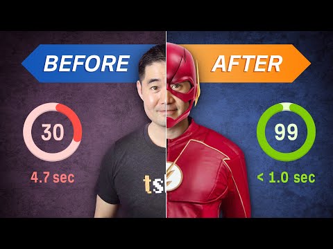
Part 9: Speed OptimizationPage speed is a conversion killer. Slow pages lose visitors—and revenue. The Speed-Conversion Connection
Speed Optimization Checklist
Tools to Measure Speed
Watch the Tutorial: Landing Page Speed Optimization Learn how to make your pages load faster.
Part 10: Add Trust Signals That MatterTrust signals reduce perceived risk and address objections before they're raised. Types of Trust Signals
The Guarantee EffectA strong guarantee can increase conversions by 20-50% by reducing perceived risk.
Watch the Tutorial: Building Trust on Landing Pages Learn how to use trust signals effectively.
Part 11: A/B Testing Your Landing PagesYou don't know what works until you test. A/B testing is how you move from guesswork to data-driven optimization. What to Test
How to Test
Testing Pitfalls
Watch the Tutorial: A/B Testing Landing Pages Learn how to run tests that yield actionable insights. Part 12: Common Landing Page Mistakes
Summary Checklist: Landing Page OptimizationPre-Launch
Above the Fold
Content
Form
Mobile
Testing
Post-Conversion
Conclusion: The Page That ConvertsYour landing page is where your advertising promise meets reality. It's the moment of truth—where visitors decide whether to trust you, engage with you, and ultimately, buy from you. A great ad brings people to your page. A great landing page keeps them there. The combination—message match, compelling visuals, clear benefits, social proof, frictionless forms, and mobile optimization—turns traffic into customers. Start where you are. Audit your current landing pages against this framework. Fix the biggest problems first—message match, load time, mobile experience—then test your way to continuous improvement. Because in the end, conversion is not about luck. It's about removing friction, building trust, and making it easy for people to say yes. Other Articles Full cast of the X (formerly Twitter) Town Square ad Discover the full cast of the X Town Square ad, featuring diverse talents and engaging performances that bring the campaign to life. Explore now! What is the song in the HP Work from Anywhere commercial? Discover the catchy song featured in the HP Work from Anywhere commercial. Uncover the artist and lyrics that make this ad memorable and engaging. How to Conduct Market Research for Better Campaigns Discover effective strategies for conducting market research to enhance your campaigns. Learn how to gather insights that drive successful marketing decisions.  Building Trust with Your Audience Through Effective Advertising Discover how to build trust with your audience through effective advertising strategies that resonate and engage. Elevate your brand's credibility today.  How to Use Customer Data to Personalize Your Ads Learn how to harness customer data to create personalized ads that resonate. Drive better results and improve your marketing strategy with our expert tips.  The Secrets to Creating Viral Advertisements Discover the secrets to crafting viral advertisements that captivate audiences and boost engagement. Unlock your brand's potential today!  How to Develop a Winning Marketing Plan Discover essential steps to create a winning marketing plan that drives results. Learn strategies, tools, and tips to elevate your business success.  Who appears in the SharkNinja vacuum commercial? Discover the stars of the SharkNinja vacuum commercial and learn more about their roles and impact in this engaging advertisement.  What is the background song in the Dyson vacuum cleaner commercial? Discover the captivating background song featured in the Dyson vacuum cleaner commercial. Uncover the artist and track that enhances this innovative ad.  Who sings in the Maytag “Man vs Machine” ad? Discover the voice behind the Maytag "Man vs Machine" ad. Uncover the artist and the story behind this memorable commercial that captivates audiences.  Meaning behind the Bosch dishwasher quiet commercial explained Discover the meaning behind Bosch dishwasher quiet commercials. Explore how they highlight efficiency, innovation, and the brand's commitment to quality. |